- Be Your Own Design Team
- Posts
- UX Portfolio: Making your stories clear
UX Portfolio: Making your stories clear
UX Design Express #18
Aneta Kmiecik
January 10, 2025
Hello, it’s Aneta here 👋 This is issue #18 of UX Design Express and today we’re talking about one key storytelling rule I promised to share with you in this post
Make your portfolio stories clear
You can use the best template, write about the problem, and explain your design decisions, but if you don’t do it well, everything can still fall apart. So, what should you do? Let’s talk about clear writing ✍️
Story outline:
Practical tactics on clear writing
Tools and resources for portfolios 🛠️
UX Portfolio Spotlight 🔦
Practical tactics on clear writing
1️⃣ Use writing rhythm
Don’t just include a 10-line description. Chunk it into consumable and scannable pieces of text:
Make sentences shorter
Divide longer paragraphs
Use bullet points
Add headings
Play with visual hierarchy
When hiring managers see a wall of text in your portfolio, they might immediately feel the weight on their shoulders. You don’t want that. You want them to feel good, so make it light and easy to consume.

2️⃣ Avoid jargon
I know you want to look professional, and using wording from a UX book might seem like the perfect solution. However, relying on buzzwords won’t make your story clearer. Instead, it will make it look identical to any other “cookie-cutter” portfolio. This sentence: “I optimised the information architecture to enhance user experience”, is too generic to be clear.
Do this instead:
Use plain language
Use conversational language
Share your unique stories
Use your own words

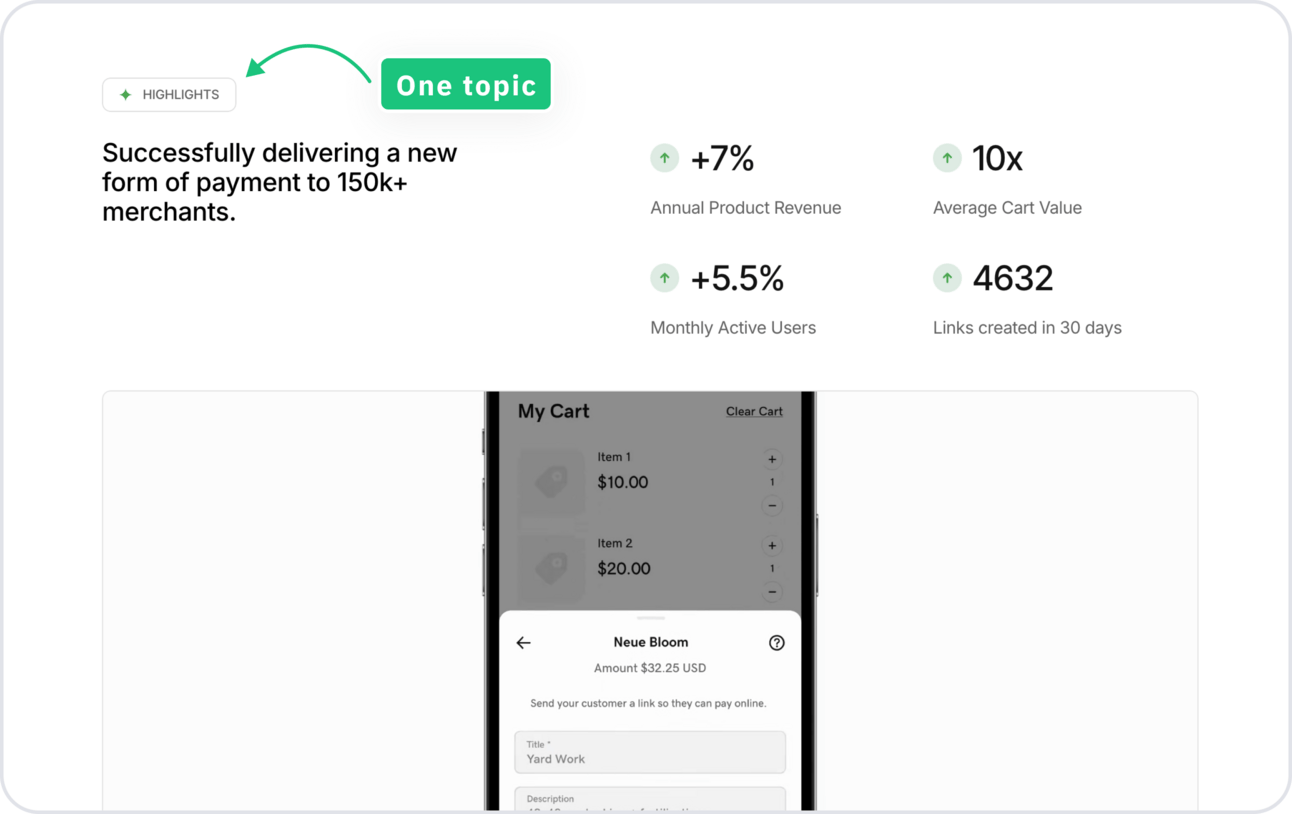
3️⃣ Talk about one topic in a paragraph
This organisational method not only prevents confusion but also makes it easier for hiring managers to quickly scan and grasp the important information. When readers can easily identify and understand the main story of each case study, they're more likely to appreciate your work in this project.
Tools and resources 🛠️
Struggle to write your case study titles? Here are great examples
Check out this recruiter’s tips about building a successful UX portfolio
Dealing with NDA? No worries. We all do. Check out these tips
If you’re a freelancer, you need to see this portfolio
I've reviewed so many portfolios that I can tell when designers have redone theirs, like Daniel did recently
UX Portfolio Spotlight 🔦
In each newsletter, I pick one portfolio from the submissions for a free review. I won’t sugarcoat things or focus only on the positives - you can find that anywhere. These reviews are here to help you learn and show that building UX portfolios is challenging but normal. You’ve got this! 💪
This time, I chose Isabela’s portfolio for review because she asked an important question:
Today I see that portfolios are very focused on visual design, and my projects have always been more involved with data (…), not necessarily creating aesthetically appealing websites (…) how to make my projects attractive even if they are not focused on visual design.
Many designers struggle to showcase non-visual projects and make a strong first impression without polished mockups. Hiring managers, like most people, are influenced by the aesthetic-usability effect and tend to appreciate more high-quality visuals in portfolios. So how to deal with the lack of strong visuals vs the need for it in your UX portfolio?
1️⃣ Good visual tactic
Isabela used Notion to create her portfolio, with a simple one-column layout. This layout adapts well to different screen sizes, creates a good first impression, and makes the case study easy to read.

2️⃣ Potential visual improvements
A common misbelief in building UX portfolios is thinking they should be a 1:1 copy of your UX project and its artefacts. For example, if you did a lot of research, you include everything. If your insights were on sticky notes, you add a screenshot of them. And if your mockups weren’t polished, you show them as they are.
This is absolutely not true. Your portfolio is your another UX project and you have the right to design it. So don’t be afraid to:
A. Design a presentation of research insights
Isabela’s presentation (left), Juyoung’s presentation (right)

B. Create a visual presentation of learnings from competitor research
Isabela’s presentation (left), Juyoung’s presentation (right)

C. Show design concepts in a good looking mockups
Isabela’s presentation (left), Ebru’s presentation (right)

The story structure in this case study has the same problems that I discussed in the previous newsletter issue so make sure to check it out here.
Practical tips and templates for these 3 points will be available in the upcoming UX Portfolio Course.
Don’t miss your chance and submit your portfolio for a free review. While I can’t promise to review every single one, I’ll be selecting a few to provide feedback based on first impressions and overall design.
That's it for today!
The UX Portfolio Course is launching soon ⭐️
Make sure you follow me on social media to get daily updates about the course.
See the behind the scene on Instagram
Get more portfolio inspirations on Linkedin
Keep designing ✨
Aneta