Quick note from me
Thank you to everyone who filled out the survey! Yesterday, I announced the winner of the lucky draw. They’ll get a 30-minute chat with me. If it wasn’t you, no worries, there’ll be another chance soon. More details to come.
The second topic is all about giving you my suggestions on how to improve your portfolio website. If you’re interested, you can submit yours using this form.
Today, we’re talking about storytelling and one simple tip that can transform your portfolio from hard to follow to instantly scannable.
Story outline
Level 01: The mistake most designers make
Level 02: Why headings matter more than you think
Level 03: How to write headings that hook
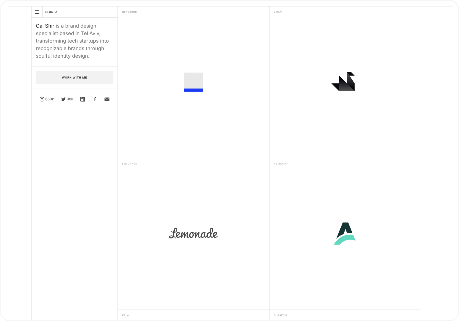
Portfolio I’m loving this week
Level 01
The mistake most designers make

Not engaging case study story structure
Many designers still use process-based headings like: Discovery → Research → Ideation → Prototyping → Testing
It looks structured, but it tells nothing about what actually happened. It’s like labeling your Netflix series episodes as “Episode 1”, “Episode 2” and “Episode 3”. You’re not giving the reader a reason to care.
Headings should tell your story, not describe a process.
Level 02
Why headings matter more than you think
Recruiters and hiring managers often skim your portfolio for 10–30 seconds before deciding if it’s worth their time.
Good headings work like a highlight reel. They:
Tell your story, even if someone only scans
Make your process easy to follow
Pull attention to your key results or decisions
When your case study is scannable, your value becomes obvious.
Level 03
How to write headings that hook
Think of each heading as a mini hook that answers one question: What’s the point of this section?
A few examples:
User Research → Discovered users were skipping onboarding
Ideation → Explored 3 radically different layouts to improve navigation
Testing → Prototype reduced checkout errors by 25%
The difference? The second version tells a story. You can almost read the case study without reading the paragraphs below. And that’s honestly the whole point.
💡 Pro tip: Write your headings first. Then check if your story still makes sense when you read them in order. If yes, you nailed it.
For more about storytelling, check out my course.
🔗 Portfolio I’m loving this week
The art of letting your work shine
Gal is a brand designer. His portfolio is a perfect example of how to make the work the main actor, not the portfolio itself.
What works here?
Colour used only in the project visuals, making the work stand out at a glance
Simple but precise visual design elements: clean layout, limited colours, basic font, simple grid, short intro text
Absolutely no fluff
Gal’s portfolio shows that you don’t need much if your work speaks for itself. The takeaway? Focus on building your skills and showing your best work. That’s the strongest proof in any design portfolio.
🫶 Together with Framer
Framer’s latest updates make websites smoother than ever
Framer templates don’t have to look boring. Here’s why they’re so good:
Design pages (design and build in one place)
Right-to-left layout (for languages that read from right)
Cal.com component (the calendar I use!)
Stagger effect (new on appear type)
Lightbox effect (image to overlay)
Fit image (adaptive image sizing)
Ready to build websites on Framer? Start today
What would improve this newsletter for you?
Want help with your UX portfolio? 🎁
Sign up for a call with me to discuss your portfolio
Get an async portfolio review (no call)
Questions? Reply directly.
Keep designing ✨
Aneta


