Quick note from me
Last week, I ran a voting poll in my Instagram Broadcast Channel, and most of you chose storytelling on the job as the next newsletter topic.
So today’s issue is all about how to present your work to stakeholders, explain your decisions clearly, and get buy-in without oversharing. I’ll share what’s worked for me over the years.
And as always, if you want me to cover something specific next time, just hit reply and tell me.
Story outline
Level 01: Start with framing (your story agenda)
Level 02: Use a simple story structure
Level 03: Explain the problem with evidence
Level 04: Show the change you’re proposing
Level 05: End with a clear recommendation
Level 06: Keep the energy high and read the room
Level 07: How to present when stakeholders only have 5 minutes?
Student spotlight
Level 01
Start with framing (your story agenda)
Before showing any designs, set the scene so stakeholders know exactly what kind of input you need from them. Use this simple agenda to open your presentation:
What we’re reviewing
Be specific: a user flow, a feature concept, a problem, e.g. Today we’re reviewing an onboarding directionWhy now
Highlight 1 problem, e.g. Engagement dropped 12% in the middle of the flow, so we’re exploring alternativesWhat decision you need from them
Alignment? Prioritisation?, e.g. I need a decision on which direction to take into user testing
Short reminder on scope
Keep the meeting focused on 1 problem. If the project is large, split it into smaller scopes and possibly a couple of meetings.
Example:
Today we’re reviewing 3 onboarding concepts. We’re doing this now because completion drops by 12% on step 2. I’m looking for alignment on which direction to take into testing.
Remember: If you walk in without an agenda, you get random feedback. If you walk in with a clear story, you get concrete input.

Level 02
Use a simple story structure
For online portfolios you can use my course framework: Problem → Change → Retrospective, but on the job, you haven’t delivered impact yet. So use this structure instead:
Problem → Why it matters → Proposed change → Expected outcome
This gives the room:
Clarity on what you're solving
Understanding of its business impact
Confidence that your direction is intentional
Avoid dumping UX steps (interviews, personas, journey maps). Stakeholders care about direction and consequences for business, not methods.

Level 03
Explain the problem with evidence
Explain the problem on 2 levels:
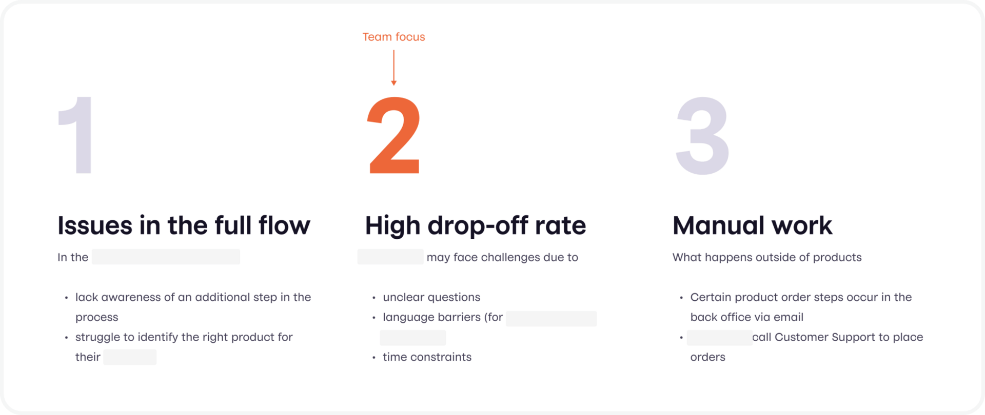
User problem → what people struggled to do and what the negative consequences were
Business problem → why this matters now for biz (conversion drop, churn risk, support cost etc.)
Use concrete evidence to make the problem real:
A short video clip from user interviews
Screenshots or flow snippets showing friction
A metric trend (even a simple line chart)
A quote wall with 3 aligned user comments
Tip: If you don't show evidence, stakeholders will challenge the problem. If you do show evidence, they challenge less and align faster.

Level 04
Show the change you’re proposing
This is where you connect pain points to your design decisions. Keep the presentation structured. Talk about:
Pain point
Your design change
Why this solves the problem
Any constraints that shaped the decision
Trade-offs
Example:
Users were dropping off at step 3 because the task looked too long. We tested 3 flow options and a condensed version performed best. This option reduces time to completion and fits engineering constraints for Q1.
Use contrasting options, not concepts that vary in UI detail:
Strong: radically different flows, steps, or mental models
Weak: 3 screens with the button moved around
This shows maturity and helps stakeholders choose direction, not layout.

Level 05
End with a clear recommendation
Never end with “What do you think?”
It feels polite, but it doesn’t work. It invites random opinions, puts the responsibility back on stakeholders, and makes you sound unsure, even when your work is strong.
End your presentation with:
Here’s my recommended direction
Here’s why it’s the most effective
Here’s what I need today (decision/input/alignment)
Stakeholders don’t want to guess what you need. They want direction, confidence, and a clear next step.

Level 06
Keep the energy high and read the room
Energy sells ideas. If you sound unsure, people will be unsure.
Tips that worked for me:
Start with your strongest point first
If the room gets bored, move on
If they react strongly, dive deeper
Use your voice and pacing to keep attention
Don’t read slides (practice before)
Treat it as a conversation, not a performance
And always connect design to outcomes:
Strong explanation: I chose this flow because it helps users complete the onboarding with fewer distractions and makes the next step more obvious
Weak explanation: I moved the button because it looked cleaner

Level 07
How to present when stakeholders only have 5 minutes?
This happens more often than we admit. When I worked in Japan, I often had late night check-ins that lasted barely 5 minutes, and that’s where I learned that clarity always beats volume.
Use a one-pager presentation with:
1 problem
1 short context paragraph
2–3 contrasting options
1 recommended direction
1 key expected outcome
If they only have 5 minutes, your job is to remove ambiguity. The more you show and tell, the more confusion you create.
⭐️ Student spotlight
Natural storytelling that feels effortless

Elaine is a designer who’s been refining her portfolio inside my course. She comes from a B2C background, working on conversion challenges, with a foundation in Graphic Design.
What works in her portfolio:
Clean, jargon-free storytelling that’s easy to follow
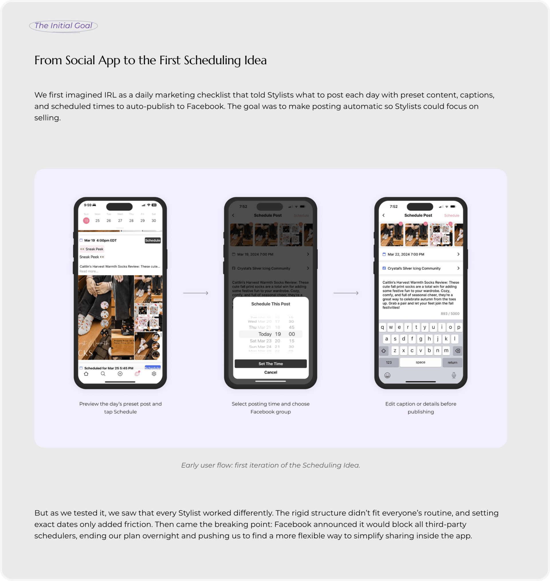
Contrasting structures like “The goal was…”, “But…”, “Then came the breaking point” that make the story engaging
Honest inclusion of constraints instead of a perfect-world narrative
Case study titles that tell the story instantly
Visuals paired with annotation notes to guide understanding
A balanced rhythm of text and visuals that makes the case study scannable
Elaine is still polishing her portfolio, but her storytelling already stands out. It’s simple, natural, and not forced. The kind of clarity hiring managers love.
The takeaway: Keep your storytelling real and conversational. Natural clarity always beats fancy jargon because it helps people understand your work fast. It’s more scannable, easier to follow, and that’s exactly what matters when recruiters have limited time.
🫶 Together with Framer
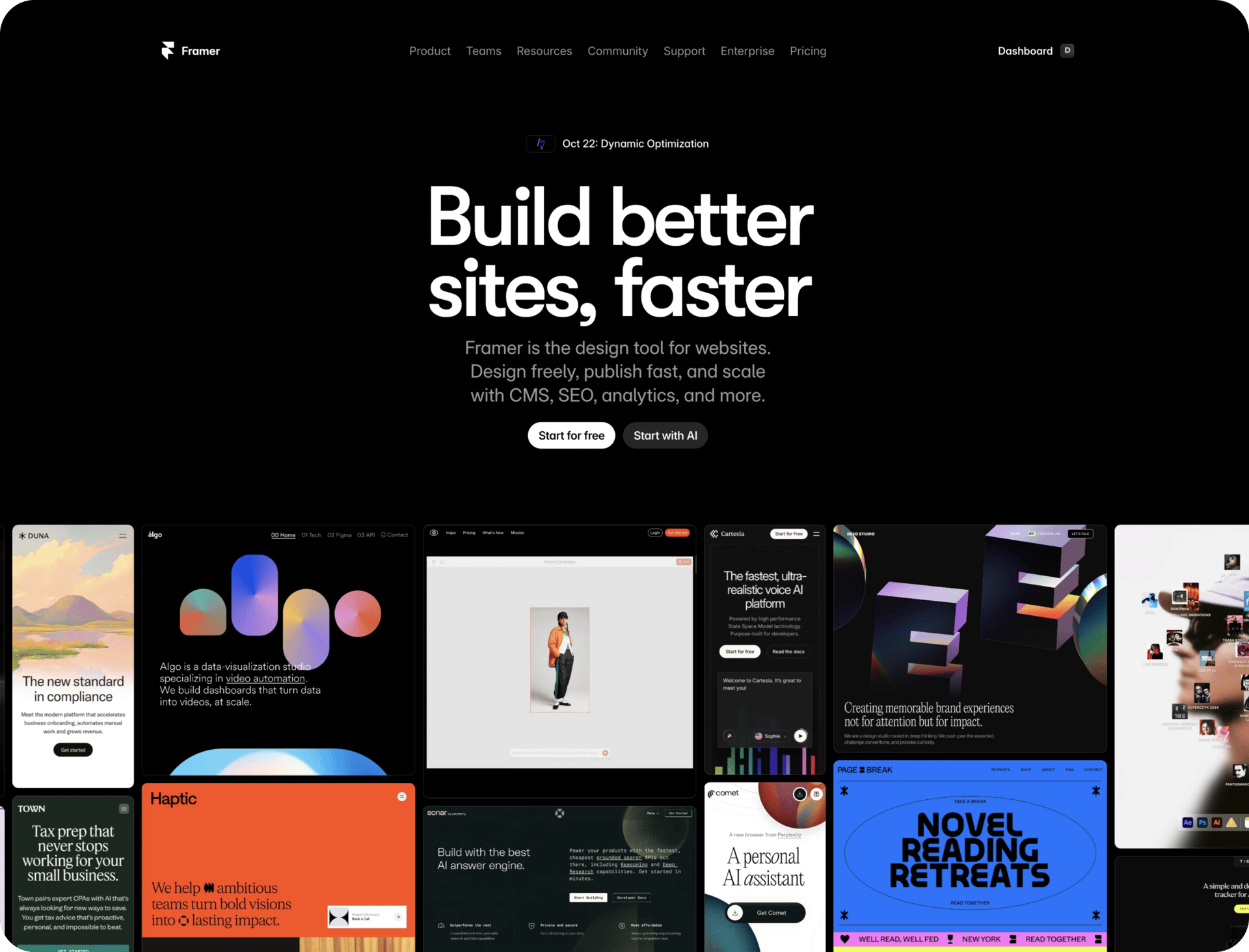
The no-code web design platform I recommend for design portfolio websites: Framer
Framer can help you launch your own portfolio website without stress. If you’ve been using Figma to prepare your designs, Framer won’t feel like a new environment.
Why I recommend Framer for a design portfolio:
Good-looking Framer templates · especially helpful if you struggle with visual design
Flexible work environment (canvas) · you can keep all your inspirations there
Familiar interface to Figma · no steep learning curve for beginners
No-code interactions · no need to write any code
Easy responsiveness setup · all breakpoints visible at once
Built-in analytics · see where hiring managers drop off
And more.
Ready to build your portfolio on Framer? Start today
How confident do you feel presenting your work to stakeholders?
Want help with your UX portfolio? 🎁
Build your UX Portfolio with this course
Book a portfolio strategy call with me
Questions? Reply directly.
Keep designing ✨
Aneta


