Quick note from me
The portfolios I remember most show the least.
That sounds backwards. But since 2020, I've been reviewing portfolios, coaching and hiring designers. I've seen it over and over. The ones that stick aren't the longest or with the largest number of projects. They're the clearest.
Most designers I work with start by adding more: projects, process, visuals. At first, it feels like the right move. But when everything is highlighted, nothing is clear. It becomes harder for recruiters to understand your story.
Knowing what to leave out is a skill. And it changes how your entire portfolio is read. Not because less is always better, but because strategic omission creates focus, curiosity, and room for conversation.
Story outline
Level 01: Control the story across portfolio and presentation
Level 02: Split your portfolio stories intentionally
Level 03: Cut your online portfolio down, save details for the presentation
Level 04: Show projects that match your target role
Level 05: Delete 99% of the problems and 10 different topics
Level 06: Delete the visual and word clutter
Level 01
Control the story across portfolio and presentation
Most designers build their online portfolios and presentations separately. That's a missed opportunity. Think about them as one system, used at different moments. When you plan both together, you control the narrative: what to reveal, when, and why.
Online portfolio:
Async, works without you
Scanned in approx. 30 seconds
Goal: show fit quickly, positioning
Portfolio presentation:
Sync, you’re in the room
You can add context and answer questions
Goal: go deeper, evolve the story
Example:
Online: “Reduced cart abandonment by 15%” with 3 key design decisions
Presentation: Add a story about how you convinced the PM to delay launch. Same project, but now it also shows collaboration and influence.

Clear online portfolio showing one design decision (my old project)
Level 02
Split your portfolio stories intentionally
You don't need to tell everything to make a strong impression.
20% Online Portfolio: Clear positioning, key decisions, high-quality designs. Enough to get you the interview.
30% Portfolio Presentation: Collaboration, customised story. Proof you can go deeper.
50% Never mentioned: If something doesn't strengthen the story, cut it.
Show everything and nothing feels clear or interesting. Show everything at once and there's nothing left for a conversation.
2 storytelling theories that support this:
Hemingway's iceberg theory: A story is stronger when you don't tell everything
Open loops theory: We remember unfinished things better than finished ones
If a recruiter sees a fit, they’ll want to dig deeper. Your job is to show enough to confirm the match, not explain everything upfront. That doesn’t mean being shallow. Clarity comes from precision. Pick fewer projects and show both breadth (the full picture) and depth (one flow or decision explained well).
Example:
Online: “Redesigned settings page”
Presentation: “3 teams owned different sections, I facilitated alignment before touching UI”
Never mentioned: 2 weeks on dark mode that was cut, if it's not relevant

Hemingway’s Iceberg Theory
Level 03
Cut your online portfolio down, save details for the presentation
Your online portfolio works without you. Recruiters skim it in 30 seconds. Your job isn't to explain everything, but to show fit.
Online Portfolio → Keep only the essentials:
1 problem
1–3 decisions
1 outcome
Lead with visuals, cut text, add white space
Portfolio Presentation → Now you can talk:
You're in the room. Show why you're right for this role.
How you handled conflicts
Additional challenge you tackled
Collaboration challenge
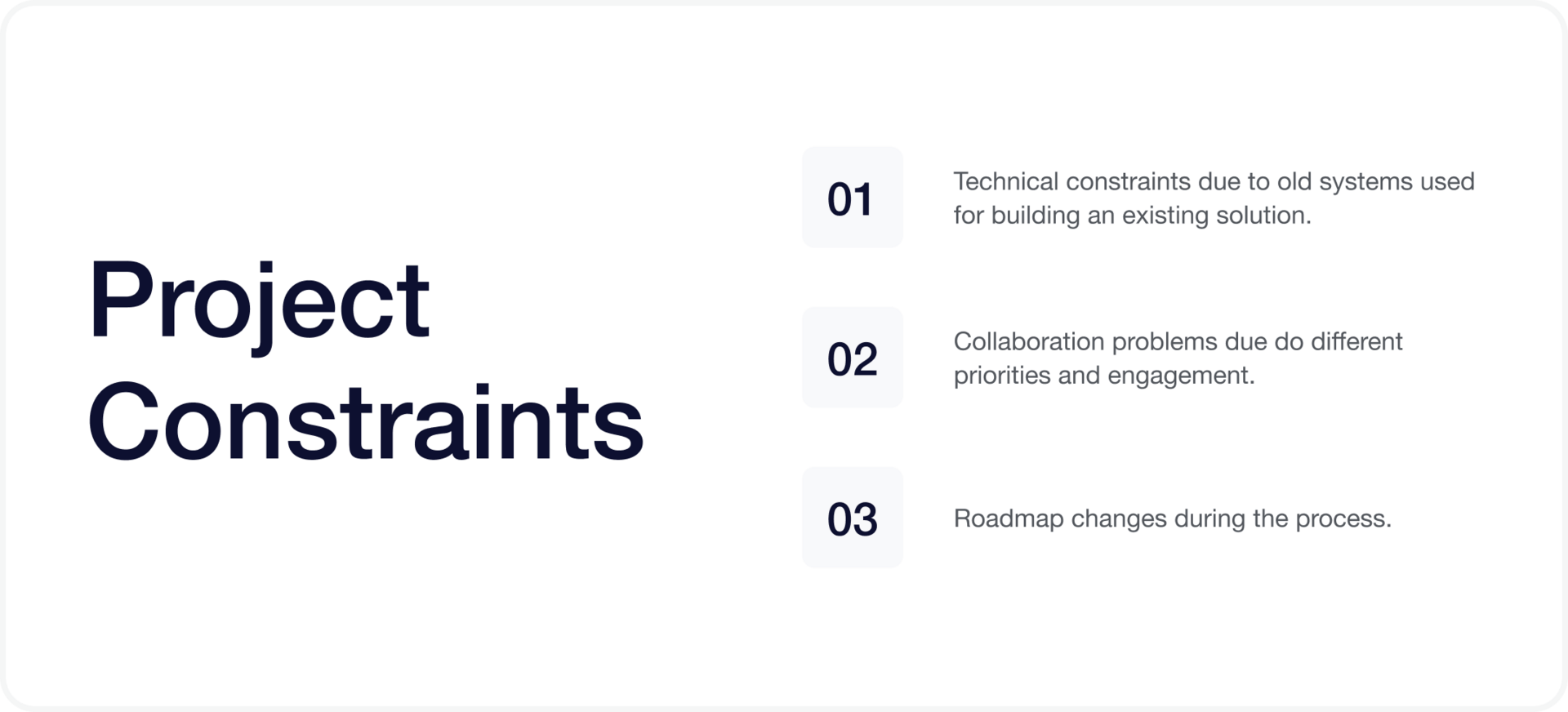
Constraints - stakeholders, timelines, tech limits
Ask before each one: What does this team care about? Which parts of my work matter here?
Examples:
Online: “Reduced onboarding time from 4 minutes to 90 seconds” → Shows result
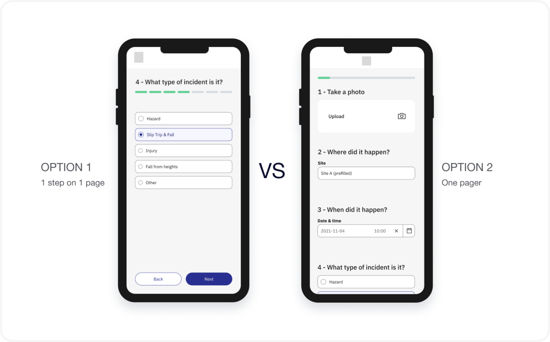
Presentation: Add how you got engineers to rebuild the flow mid-sprint → Shows leadership

Additional challenges discussed in an old portfolio presentation
Level 04
Delete mixed profile signals
Show projects that match your target role. 1-4 strong case studies beat 20 irrelevant. Every project should clearly communicate your designer profile.
Remove irrelevant projects
Don’t show everything, show enough to prove fit
If a project doesn’t support your target role, cut it
Adjust story to your designer profile:
Visual designers → More visuals (craft, design systems, branding etc.)
Systems thinkers → Ecosystems (experience with a few products etc.)
Startup designers → 0→1 work (new apps, new design system etc.)
Split project stories into a few stories:
One work project doesn’t have to equal one case study. A single project can contain multiple strong stories, each proving a different skill.
Example:
Applying for a product design role at a fintech startup? Drop the brand identity project. Keep the checkout flow redesign and the 0→1 feature: one case study for each. This shows relevant skills without overloading one story.
Level 05
Delete 99% of the problems and 10 different topics
Trying to show everything is the fastest way to say nothing. One clear problem is easier to understand, remember and discuss than a long list.
Delete 99% of the problems:
Focus creates clarity and makes your decisions easier to follow.
Pick 1 problem that matters most
Relate every decision back to this problem
Frame it as 1 user problem + 1 business problem
If it doesn’t support that core problem, it doesn’t belong.
Delete 10 different topics:
Fewer topics reduce cognitive load and make your story feel intentional and confident.
Keep 1 core topic per section or slide
Show only visuals that support that topic
Go deep on 1 thing, not shallow on 10
Example:
Instead of listing 5 problems in one case study, focus on one: “Users couldn’t complete checkout → reduced abandonment”. All screens, decisions and outcomes support that single story.
Level 06
Delete the visual and word clutter
Overusing UX buzzwords signals weak thinking. If you hide behind terms like “leveraging heuristics to optimise cognitive load”, you're not clarifying, you're hiding.
Delete word clutter:
Recruiters skim in seconds. Clear writing signals clear thinking and makes your work easier to understand.
Write like you'd explain it to a friend
Say it in fewer words
If a 10-year-old can't get it, simplify
Delete visual clutter:
Decorative grids, floating shapes, gradient blobs, they don't make your portfolio look polished. They compete with your design work.
Make your designs the focus
Remove distractions
Give each element one job
Examples:
Text: “Conducted heuristic evaluation to identify friction points” → “Found where shoppers got stuck”
Visual: Hero with pattern, badge, icon, tagline, 3 labels → 1 image, 1 headline
🫶 Together with Framer
Portfolio without friction
A lot of portfolio stress doesn’t come from lack of skill. It comes from friction.
Design in one tool
Build in another
Fix things later
Framer removes most of that friction.
You can design your portfolio, shape your story, add motion, and publish everything from one place. If you’re coming from Figma, the transition feels natural and visual, not technical.
If you’re building or updating your portfolio, Framer is a solid place to start.
Want help with your UX portfolio? 🎁
Build your UX Portfolio with this course
Book a portfolio strategy call with me
Questions? Reply directly.
Keep designing ✨
Aneta


